GTFS Data and Commuters
GTFS data can tell us a lot about how riders use different systems and how often.
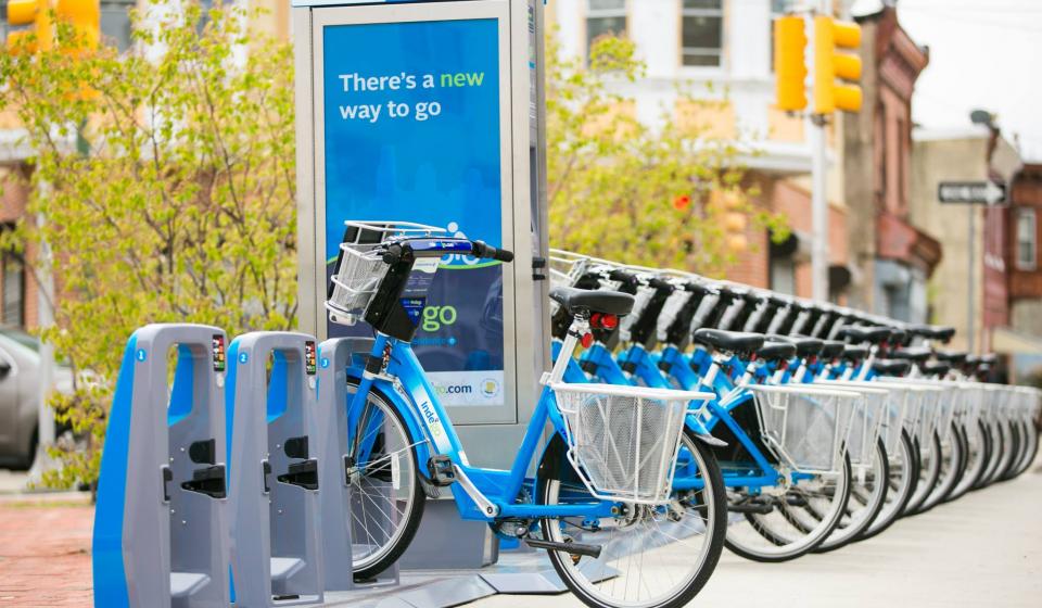
More Bikeshare, More Bike Lanes
Does the infrastructure of bike lanes relate to an increase in bikeshare memberships?
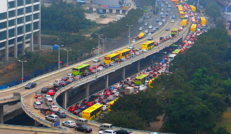
As cities get denser and transit systems get larger there may soon be fewer cars on the road.
Transportation systems across the country are adapting to meet the needs of their stakeholders. It's a basic service that many citizens rely on, so it has to work for everyone all of the time. Bikeshare, light and heavy rail, bus routes, and automotive come together for a robust network of mobility. Open data helps us see the bigger picture. Explore the dynamic transportation visualizations dashboard to see the big picture.
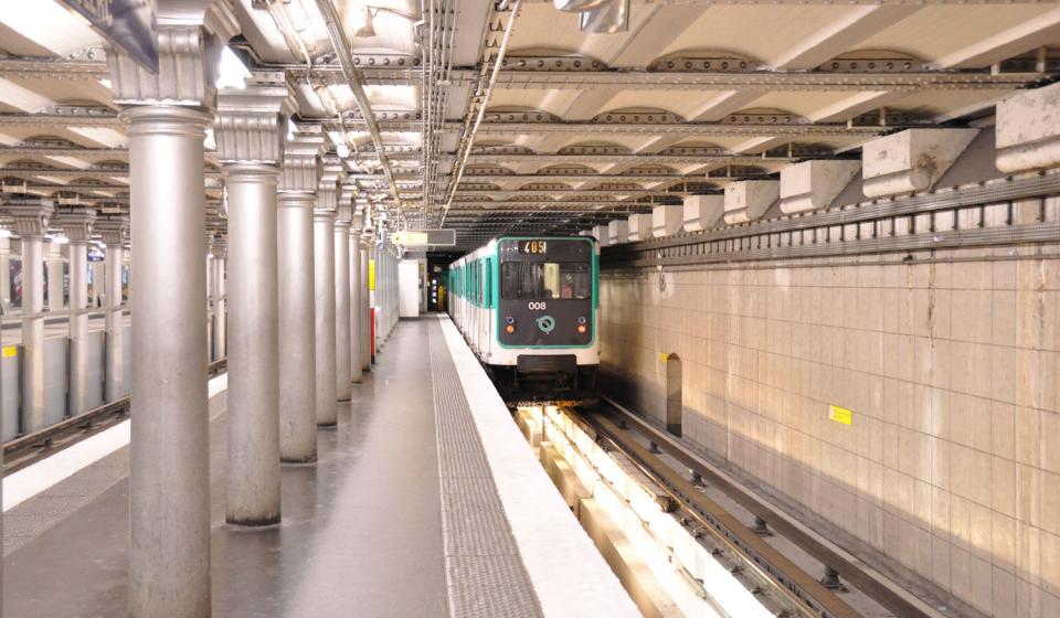
Commuter flows within America's regional transit systems
Getting from place to place looks different for every citizen, so transportation comes in many shapes and sizes. Some regions rely on local subways and trolleys while others adopt modern modes like Bus Rapid Transit (BRT) and bikeshare. In many cases, regions use a diverse combination of all transportation types to meet the needs and preferences of an increasingly multi-modal world.
The dynamic map above visualizes the traffic on Long Island Rail Road, a heavy rail line in New York City, NY.
The LIRR makes 124 stops
to serve 85,868,246 commuters annually,
298,448 of whom are weekday passengers.
On the map, each dot lighting up represents a train making a stop. The flashing map shows how many people use these services in the course of just 20 minutes. Looking at the map for only a couple seconds, it's easy to see the role transportation plays in our daily lives.
That's why it's important to have a thorough understanding of our systems and how citizens navigate within them. Visualizations provide a better way to understand complex networks, key challenges, and opportunities. Open data helps make it happen. In fact, this map was created by a citizen with open data.
Explore the map above and other visualizations on this open data dashboard to learn more about commuter flows in different parts of the country.
Miami-Dade County, Florida (Bike Lanes)
While residents in suburban and rural areas ride bikes primarily as a recreational activity, more and more biking is become a common form of transportation in urban areas. With a greater number of people on bikes, it's clear that infrastructure and resources for bicyclists is increasingly essential.
This map made with ArcGIS shows the existing bike lanes for the larger Miami-Dade County area in Florida using open data from the regional Metropolitan Planning Organization (MPO). Bike lanes are a core part of pedestrian, bicyclist, and automotive safety. They show clear right-of-way paths and encourage everyone to follow traffic safety rules. You can create your own data visualizations using digital tools and embed them onto your DKAN site.
The data released by the Miami-Dade MPO provide information about the number of bike lanes, the start and stop points, etc. With the visualization above we see the data as more than a list. It's easy to see exactly where bike lanes exist and how much area is covered in relation to the entire county. This data, along with other datasets, inform long-term plans for pedestrian and bicycle safety. The Miami-Dade MPO 2040 plan for pedestrian bicycle safety identifies major improvements that will be achieved over the next few decades.
Los Angeles, California (Metro System)
The movement of transit can be difficult to capture and quantify, let alone make into an engaging visualization. General Transit Feed Specification (GTFS) data creates a common format for agencies to provide data and developers to consume it. The dynamic heat map above uses open GTFS data to highlight the life of a transit network.
This map shows where Bus Rapid Transit (BRT) lines are operating in the LA Metro area. BRT is different from a standard bus route that is common to most transportation networks. Standard routes have stops designated, and the bus may make as many stops as needed. In some cases, a stop could mean a single city block. Bus Rapid Transit lines minimize time spent commuting as well as auto congestion by covering more ground and making fewer stops. This map is made with the digital mapping tool CartoDB. You can create your own data visualizations using digital tools and embed them onto your DKAN site.
From the spending perspective, BRT is also much more affordable, flexible, and sustainable than any rail options. Especially for newer cities without rail lines and sprawled metropolitan areas, BRT can translate into an important piece of the larger transportation network. In the case of LA, BRT could triple the size of the network without great expense.
In the visualization above, the higher the concentration of BRT lines, the brighter the color. With this map, it's easy to see which areas in LA's metro area are getting the most service (as measured by bus activity) and give agencies insight on how to best allocate resources.